A simplified design system for delicious bread
- Client
- Carrefour
- Services
-
- Packaging Design
CONTEXT
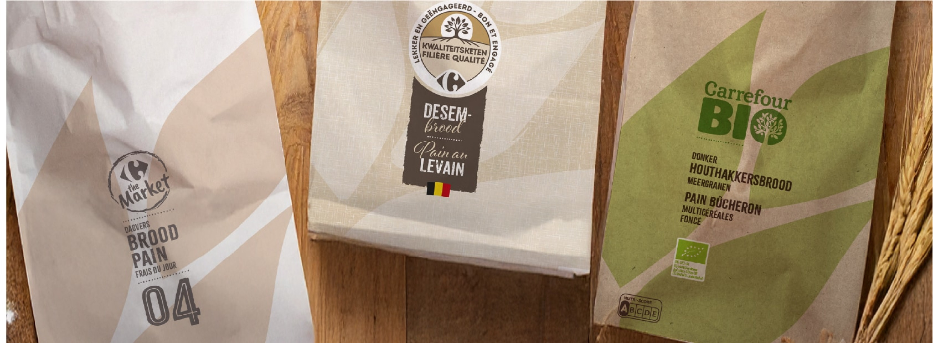
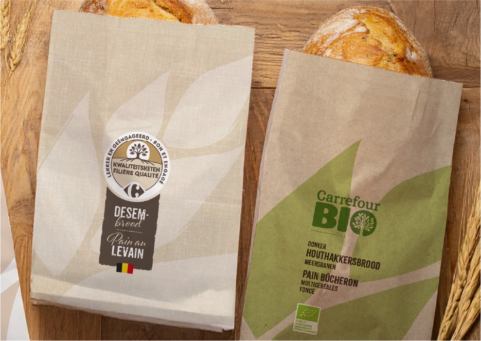
Carrefour’s in-store bakery offers a huge variety of breads, from pre-packed organic options to fresh, crusty baguettes sold loose. The sheer volume of choices often led to visual clutter, making it difficult for customers to distinguish between specific ranges like Bio or Sourdough, or to understand what made a specific bread special.
AMBITION
The goal was to simplify the shopping experience without simplifying the product. We aimed to create a unified visual system that allows for immediate identification of the range while educating the customer on the specific quality of each bread.
APPROACH
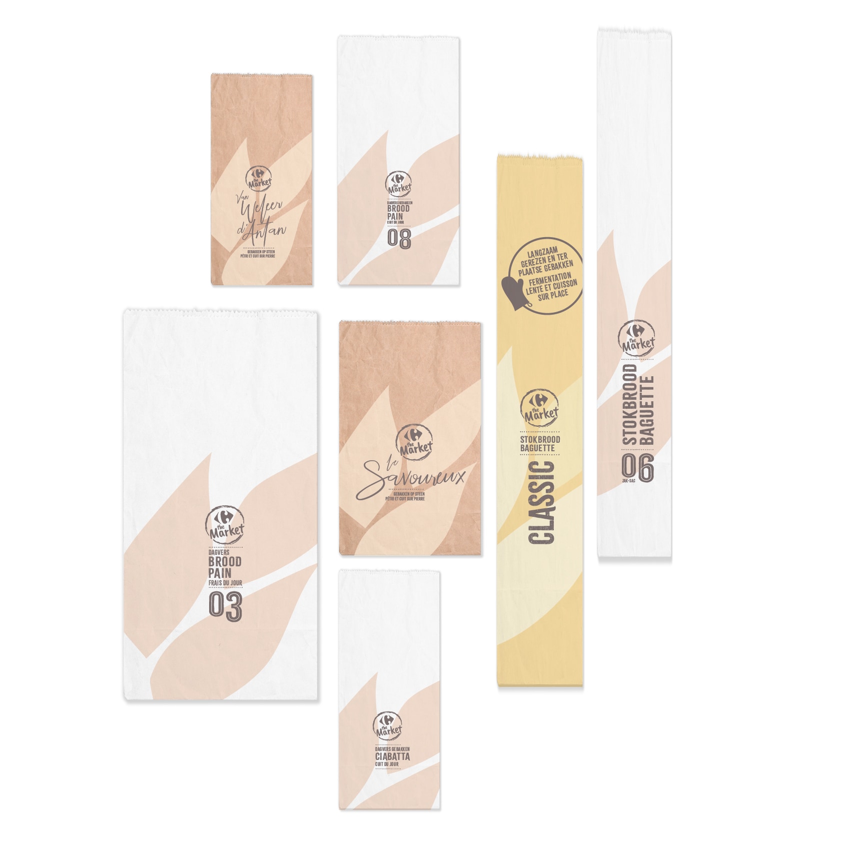
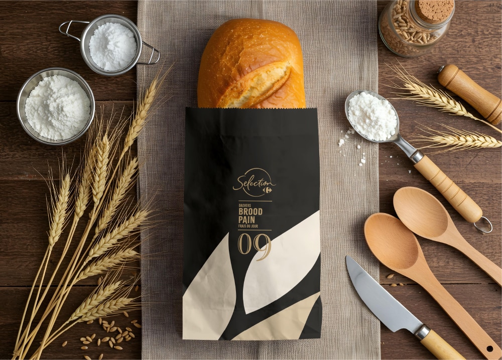
We developed a cohesive design architecture based on a stylized grain motif. To ensure instant recognition, we applied a clear colour code: green for Bio, black for Premium, and beige for Tradition. For fresh breads, we implemented a clever numbering system where customers match the shelf label number to the bag. Beyond this functional navigation, a specific bit of info is printed on each bag to highlight the bread’s uniqueness, such as its fermentation time or grain blend.
RESULT
A streamlined and intuitive bakery section. The distinction between pre-packed and fresh items is clear, and the colour coding combined with the numbering system removes friction. By adding descriptive details to the bags, the design not only helps customers find their bread but also helps them appreciate its artisanal value.