Bringing clarity to the Auchan coffee aisle
- Client
- Auchan
- Services
-
- Packaging Design
- Objectives
-
- Brand Awareness
- Inspiration
CONTEXT
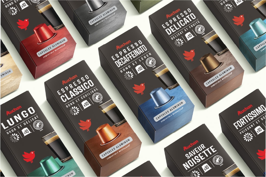
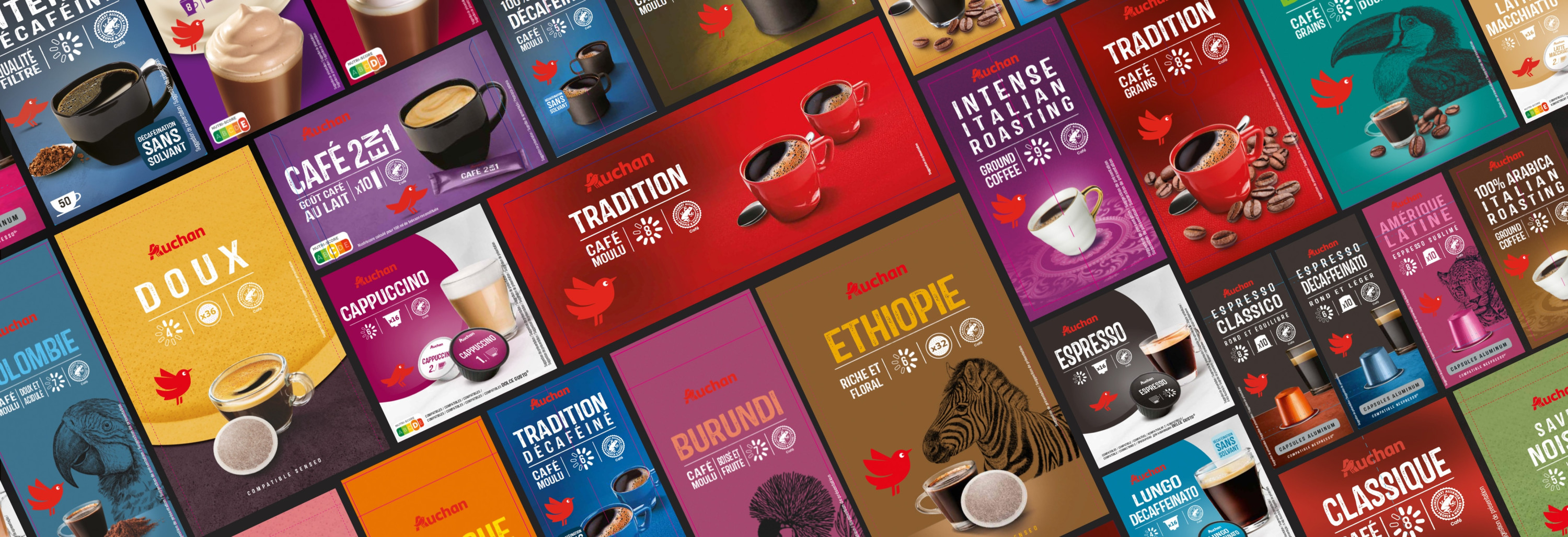
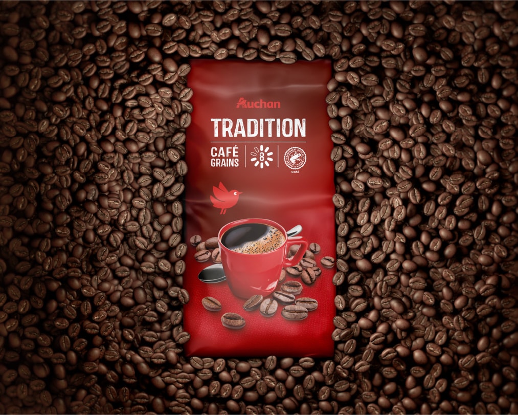
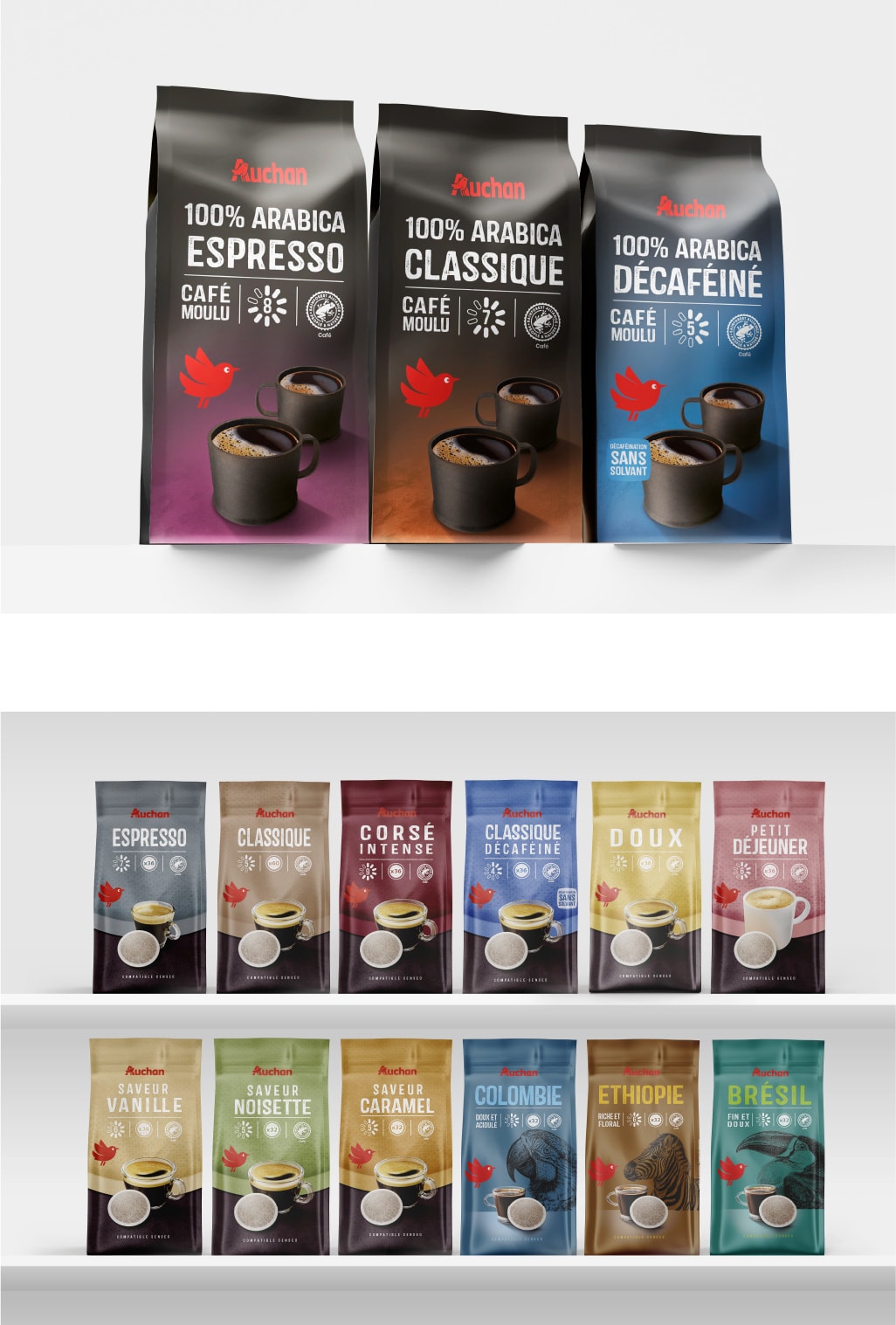
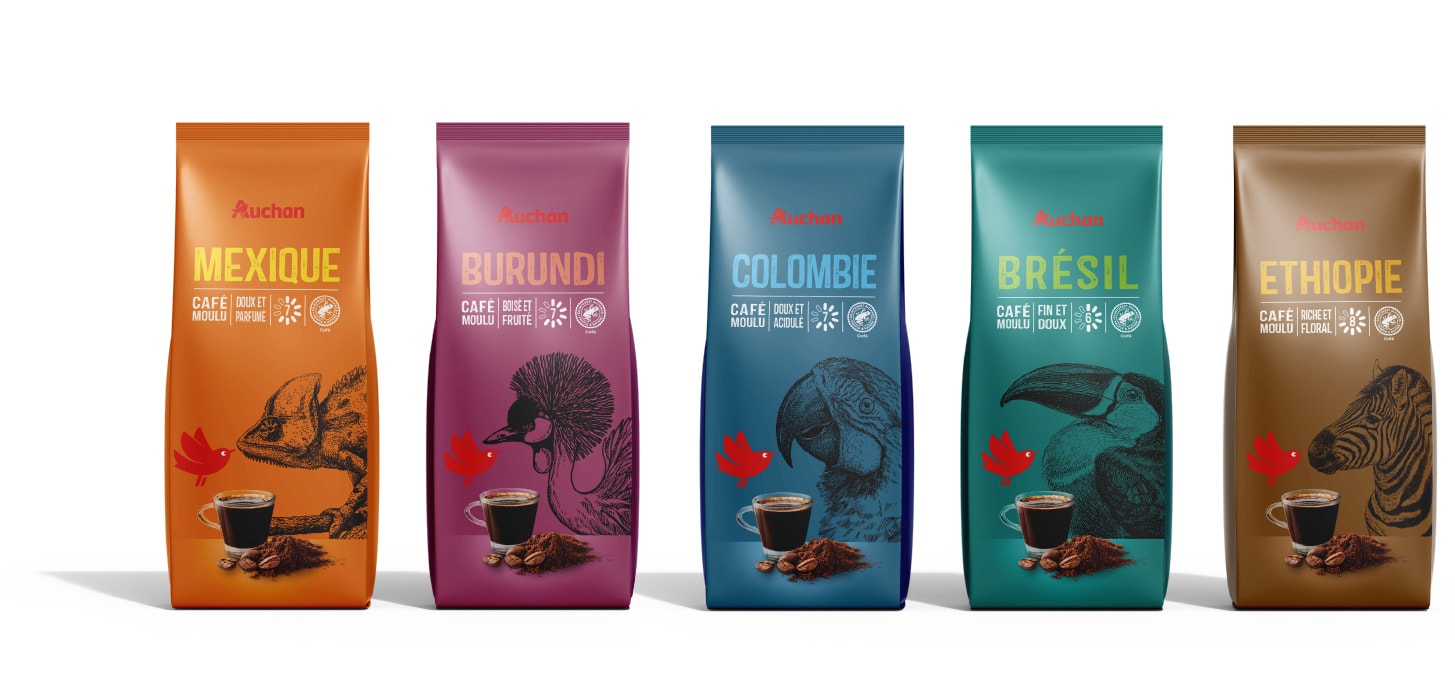
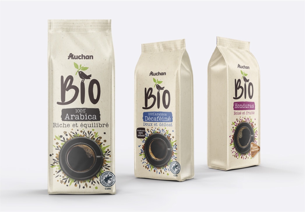
We were tasked with designing the packaging for Auchan's entire coffee category, covering over 250 references across standard and organic ranges, as well as multiple formats (beans, pods, capsules).
AMBITION
To create a clear, transversal identification system that helps consumers easily navigate the vast assortment while giving each sub-segment its own distinct personality.
APPROACH
We implemented a structured design hierarchy using typography and pictograms to clarify technical formats. Visual storytelling, such as illustrations for single-origin coffees and specific colour codes for blends, defines the sub-categories.
RESULT
A coherent and scannable coffee aisle. The design system creates unity across the range while allowing distinct identities, like the organic and single origin lines, to shine through.