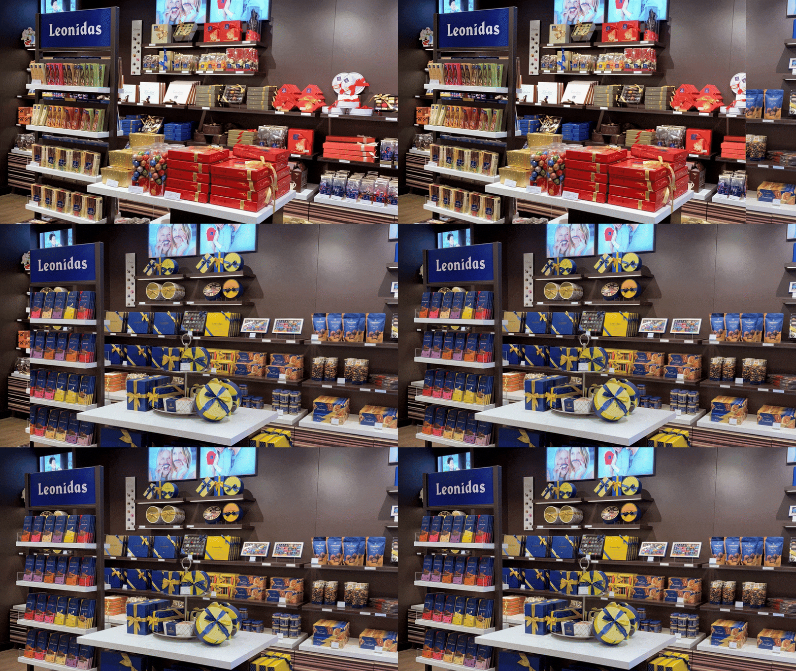
How packaging can breathe new life into stores
- Client
- Leonidas
- Services
-
- Brand Activation & Campaigns
- Packaging Design
- Objectives
-
- Brand Awareness
- Innovation
- Inspiration

CONTEXT
Leonidas, the well-known Belgian Maître Chocolatier, faced a competitive market where its visual identity had lost some of its strength. Even the Leonidas boutiques, while filled with Leonidas products, no longer fully conveyed the brand's essence, necessitating a strategic refresh to restore its visual power.
AMBITION
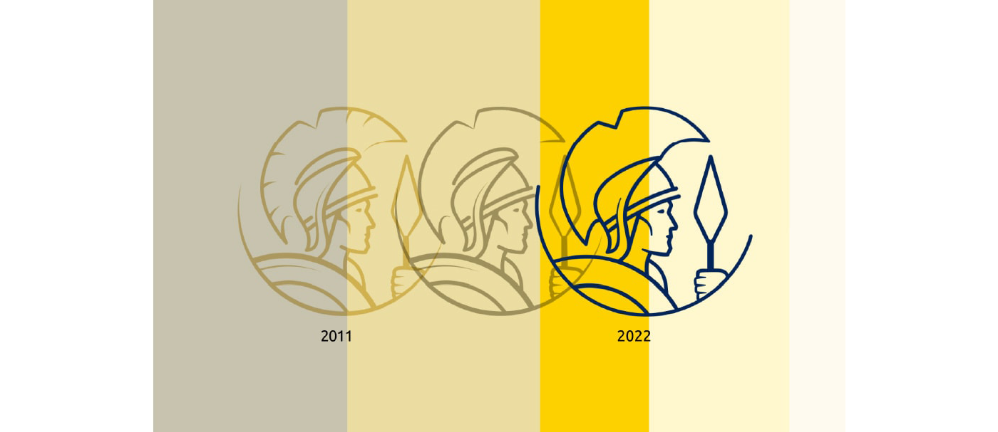
We aimed to modernize and unify the brand's image across all touchpoints. The objective was to build a bridge between the past and the future: celebrating Leonidas' rich history while creating a sophisticated, contemporary aesthetic that resonates with today’s consumers.
APPROACH
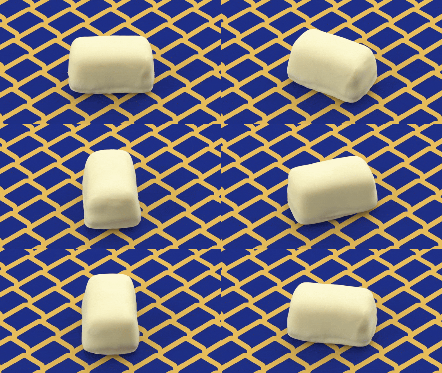
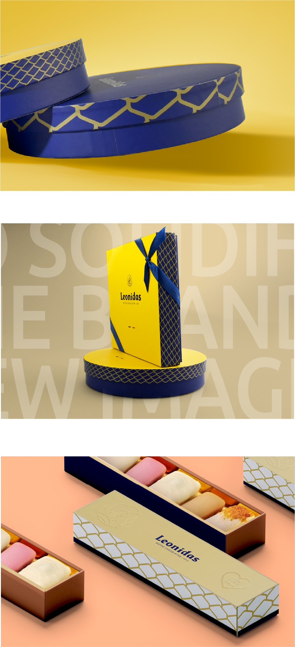
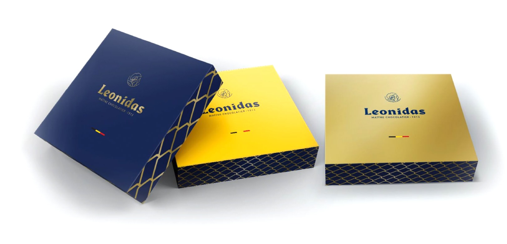
We centred the rebranding on the brand's most famous creation: the Manon. Using the praline’s unique shape as a muse, we developed a signature design featuring elegant geometric patterns. This was combined with a refreshed take on the original logo and classic colour palette, ensuring the new look honoured the brand's heritage.
RESULT
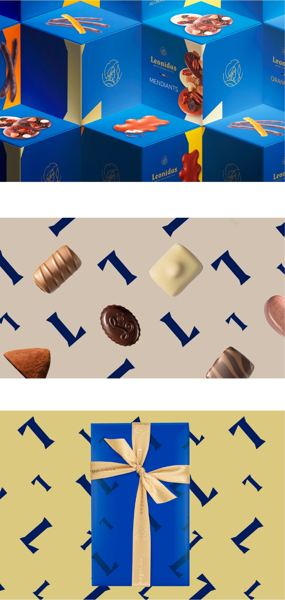
A strong, unified visual identity that breathes new life into the stores. The cohesive design creates a refined atmosphere where customers immediately recognise the Leonidas universe. This transformation secures the brand’s position in the industry, offering a consistent experience from the packaging to the boutique interior.
Before 👉 After
